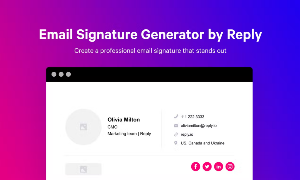
We tend to give a lot of significance to first impressions, as in you never get a second chance to make one. But are they everything, the end-all and be-all?
Sure, first impressions are important. But there’s more to a successful email campaign than writing a killer subject line.
At Reply, we think finishing strong is just as important as starting strong. That’s where the email signature comes in. Think about it: Your signature is the last thing your subscribers see. Why merely turn your name into a signature when there’s so much more to offer? Shouldn’t it be something memorable? Something worth recalling?
The anatomy of a typical email signature
Back in the day, we would simply treat our first and last name like a signature. Nowadays, the average email signature usually contains the following elements:
- Name
- Title
- Business
- Phone
First things first: Your subscribers know how email works. I promise their email client has a “reply” button, so stop including your email address. They don’t need it.
As for the rest of it, well, there’s nothing necessarily wrong with it. It’s all important information that virtually all email providers include in their built-in generic signature generators. But there’s nothing particularly memorable about it, either.
More importantly, it doesn’t market anything. And isn’t that the most crucial part of a marketing email?
Bare necessities: the 4 things every email signature must have
Before we get into the creative aspects of signature design and signature sales (yes, you read that correctly), let’s make sure you’ve got the basics. Here are four components every signature must have.
- Your Name
This probably goes without saying, but every signature should have your first and last name. Think of it like an artist signing their creation; it shows a sense of pride in your work.
- Your Title
If you’re including your name – include your title. This is especially true for founders and CEOs, because who wouldn’t feel at least a little honored to get an email from the founder of a company?
- Your Company
Sure, your subscribers should already know what business the email is coming from. But repetition is the mother of memorization, so include it one more time. The more they see it, the more likely they’ll be to remember it.
- Your Website
If you have no other marketing materials in your signature, at least include a link to your website. But make sure you use a clean link. None of that “https://” stuff. It’s ugly and unnecessary.
6 ways to make your email signature stand out
Now that you’ve got the basics, you’re probably wondering how to make a great email signature and turn it into a full-blown marketing tool. You don’t need to use all six strategies below, but try incorporating one or two into your next campaign.
Without further ado, let’s dive into what to write in a signature for emails to stand out from the crowd, leave a memorable, lasting impression on your recipients, and act as a lead generator all in one!
- Your Blog
If you have a blog, your signature should link to it. End of story. This could be a static link – “Check out our blog!” – but you’ll probably get better results by linking to specific articles. For example: New on the Reply blog: Five Questions to Ask Before Sending Your Next Marketing Email.
- Freebies
If your company has developed any free tools, make sure your subscribers know.
This could be as simple as an ROI calculator or as complex as a website analytics tool. As long as it provides relevant value to your readers, include it. Don’t have any free tools? Link to your free trial. For example: Are you getting the most out of your marketing emails? Find out for free!
- Videos
Studies have shown that videos now account for a mind-blowing 50% of all mobile traffic. If you have video content related to your product or industry, dive right into that market. Make your video materials absolutely beautiful using good video editing software.
In many email clients, just inserting a link will automatically embed the video. Your link might look something like this: Check out our MicroConf talk!
- Social Media
Social media is everywhere. Well, everywhere except email signatures, and that needs to change.
Turn your signature into a social billboard, but don’t go overboard. Link to the three social profiles you’re most active on and exclude the others.
Use icons to link to your social media accounts instead of text to add color and form to an otherwise text-based email.
- Graphics
Speaking of color and form, graphics are a great way to conclude a text-heavy email.
You’ve got a few different options here. You could include your company logo, a call-to-action, or even just a colorful border.
Just remember to embed graphics, not paste them. When you paste a graphic, it becomes an attachment your subscribers have to download to view.
- Industry Data
Whatever market you’re in, there’s bound to be data that supports your product or service. Find it, and include it at the end of your signature.
It doesn’t even need to be a direct link; just leave it as a fun fact for your subscribers. For example: Fact of the Month: For every $1 spent, email marketing generates a $38 ROI.


