

If you are tired of the stale cold email campaign building tactics used 10 years ago, it’s about time to think over a budget-warming approach. There is no need to give up the main aspects of a cold email templates creation:
- An all-business sample.
- A follow-up template.
- A sample for a decision maker.
- A follow-up to a voicemail.
- A break-up template.
- an abandoned cart sample, and others.
The next 2018 year gives a great chance to try something new with the view of the strongest cold email campaigns 2017.
6 Tested Cold Email Content Tips
Our personal email boxes often demonstrate there are still retailers who don’t seem to understand the form of an email template has changed a lot. Here are several basic principles you should adhere to while creating a new email template:
- Avoid getting caught in SPAM folder on the go use catchy subject line expressing the main idea of the campaign. Let your targeted audience see the idea and decide on the future of the email;
- Make it clear, use from 4 to 5 sentences to get your message out. Don’t pass up the opportunity and users’ attention;
- Make your emails stand out, add personalized information to the templates and you’ll see the recipients will open it at least. Use a pronoun ‘you’ instead of ‘we’ and ‘I’;
- Let a recipient understand your business, explain what you do and why to choose your service;
- Make sure your cold email templates stand out from the crowd, don’t feed twin emails to your auditory;
- Don’t try to fasten the letter to obvious sales, on the contrary try to use the time to start future conversion. Just as you’ve worked over the contextual constituent, look through strong examples of cold email campaign 2017.
6 Examples of Appealing Cold Emails Design
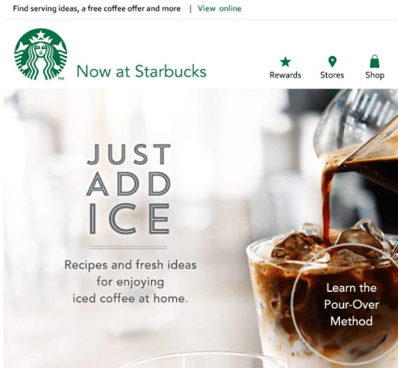
Starbucks
The newsletters design has been thoroughly thought over. Due to the fact that the email covers many aspects, the company had to find the happy mean between the text and the layout. The solution was achieved in a combination of short textual descriptions with high-quality images:
Handy
The welcome email design has become a really successful symbiosis of the informational content and a clear eye-catchy layout. The choice of the font makes it simple to skim through the letter and easily steal audience attention:

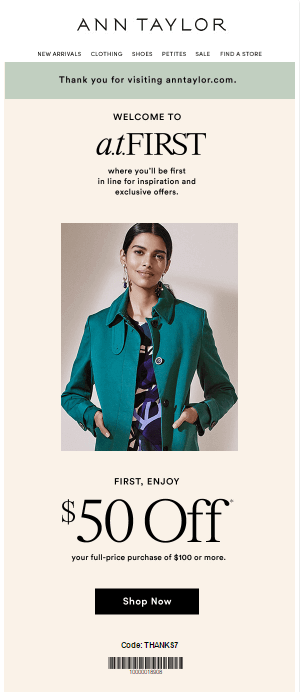
Ann Taylor
The email design is simple and tasteful. The offer is highlighted clearly, so even the fastest surfers won’t miss it. Besides, the email isn’t reloaded with any odd or irrelevant information:
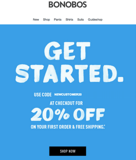
BONOBOS
Sometimes the simpler you make your email the more it sticks to customers’ memory. Bonobos decided to place a bet on simple pastel colors and strict concise content. There is nothing screaming. Absolutely everything starting from color choice and finishing with punctuation symbols is plain and affirmative:
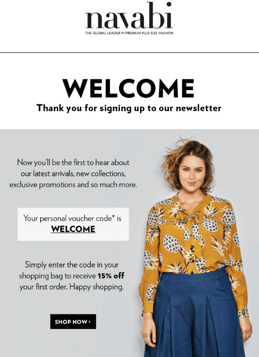
Navabi
The welcoming email template is a complete balance of brightness, the individuality of the products they sell and the simplicity of the context and layout. The design doubles down the importance of the latest collection and keeps all the additional information aside:
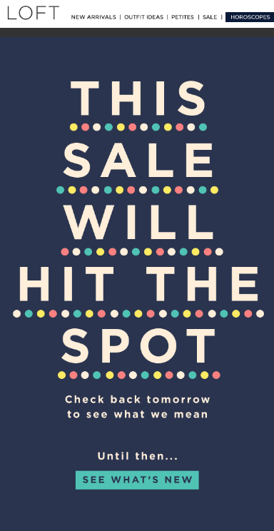
Loft
The email contains no selling information, not even a statement of a product they offer. The company applied an absolutely new approach to draw customers’ interest: a catchy announcement and an emphasis on the font:
Final Thoughts
It doesn’t matter what qualitative characteristics you will choose to use for the future cold email campaign. The main aim for you is to make a recipient understand your business goal and continue to the site. A cold email that leads to warm customer’s response will at least boost your conversion rate and result in sales growth at most.
Author:
Alina Brahina
technical writer at Amasty


